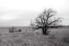
Great start. Good choice of base image; lots of negative space for text; dramatic lighting, lines and graphically appealing from multiple distances.
My suggestions: Move the text and inset photo a bit away from the left edge; mass publications are trimmed by machine and need buffer so all elements remain uncropped.
On your articles, make the header text a bit bigger than the page number text so that the newsstand viewer will quickly see the headline.
Another thing you can do with text in photoshop - expand or compress text for emphasis. Try highlighting a word or phrase and then go to Window>Character. You can make a font taller by setting the width at 100% and the height at 120% or similar. You can also "stretch" text by changing the spacing between characters. The character control is fun to play with in photoshop. BE SURE TO SET IT BACK when you are done. It won't reset on it's own.
Thanks Michele!!! I will definitely be playing with this more, and probably working on a 'series' of them. This was just goofing off this morning with some stuff i shot last night :) thanks for the feedback!!!


e+b.jpg)
3 comments:
Great start. Good choice of base image; lots of negative space for text; dramatic lighting, lines and graphically appealing from multiple distances.
My suggestions:
Move the text and inset photo a bit away from the left edge; mass publications are trimmed by machine and need buffer so all elements remain uncropped.
On your articles, make the header text a bit bigger than the page number text so that the newsstand viewer will quickly see the headline.
Another thing you can do with text in photoshop - expand or compress text for emphasis. Try highlighting a word or phrase and then go to Window>Character. You can make a font taller by setting the width at 100% and the height at 120% or similar. You can also "stretch" text by changing the spacing between characters. The character control is fun to play with in photoshop. BE SURE TO SET IT BACK when you are done. It won't reset on it's own.
Thanks Michele!!! I will definitely be playing with this more, and probably working on a 'series' of them. This was just goofing off this morning with some stuff i shot last night :) thanks for the feedback!!!
Awesome beginning! I like the graphic poles & lines.
Post a Comment